Search the Community
Showing results for tags 'theme'.
-
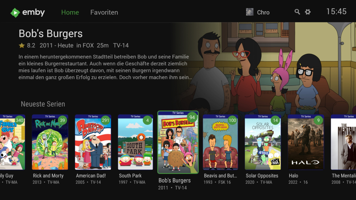
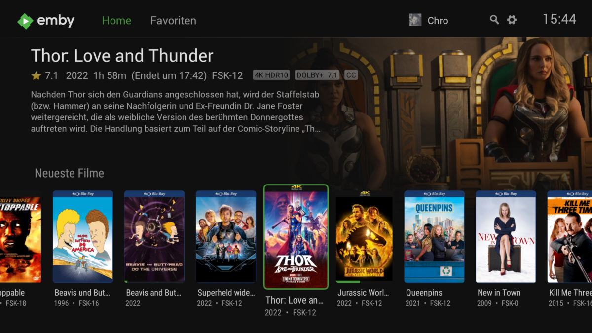
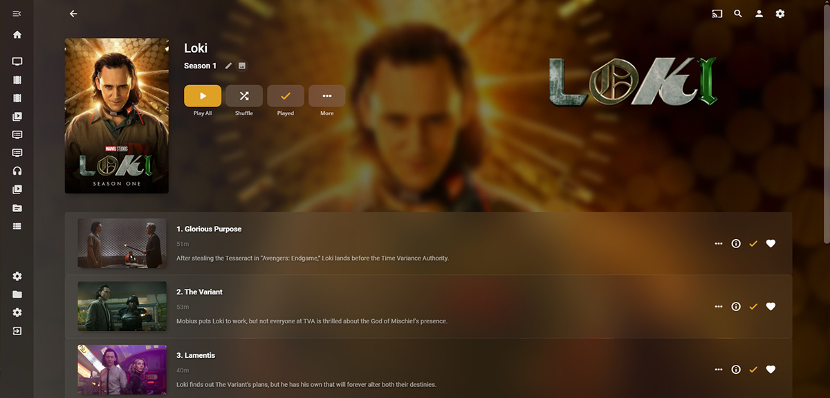
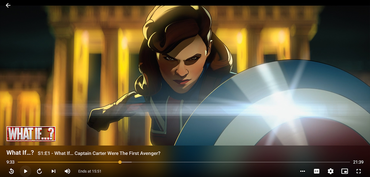
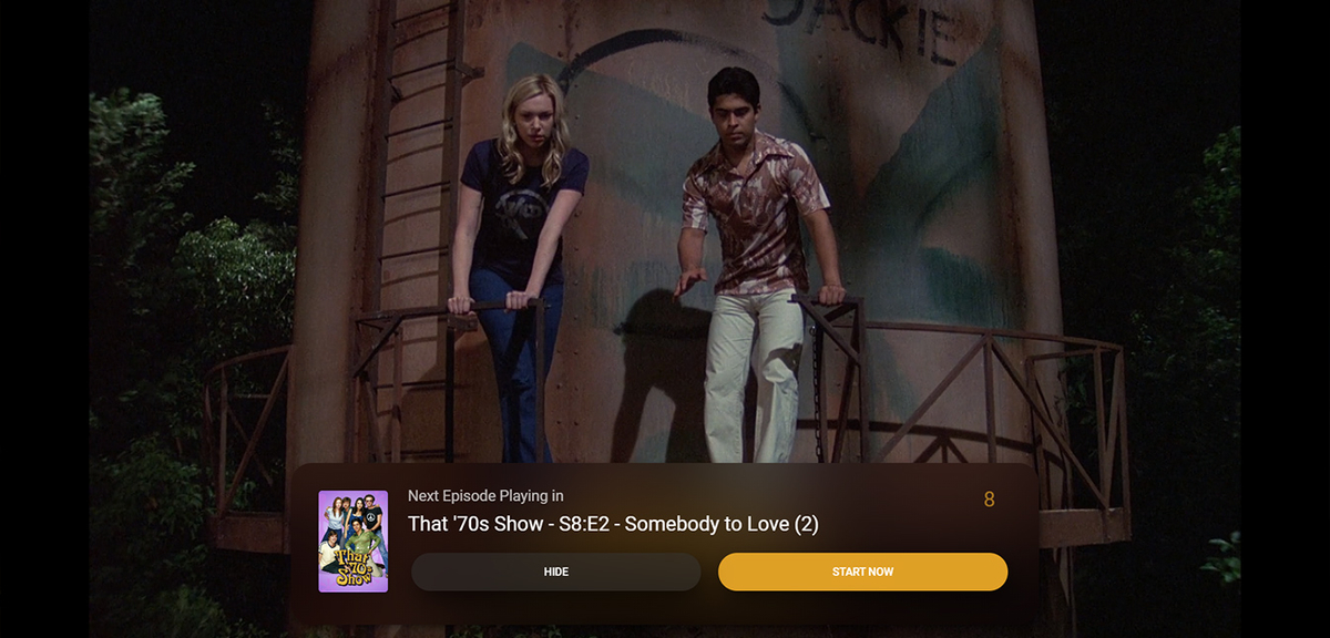
I moved from Plex to Emby and even though I think Emby is superior in its flexibility there are some things I like better with Plex, especially in terms of its looks. This theme is trying to fix that by making it a bit more similar to Plex but with some, in my opinion, improvements. The CSS is attached to this post for anyone interested and below are some screens to show it off Good to know I only use Chrome so I can't guarantee this CSS works as expected in other browsers. If you want the sidebar menu to look like in the screens, make sure to pin the sidebar. Watched badge/banderoll is inverted which means that the badge will not be shown if media have been watched, like in Plex. For desired look, please use the "Dark" theme for both Theme & Settings theme in the display settings. Emby-Stable-style-v2.4.txt Emby-Stable-style-v2.5.txt Emby-Stable-style-v2.6.txt Emby-Stable-style-v2.7.txt
- 401 replies
-
- 64
-

-

-

-

Custom Theme: State Street Theater (ver 1) Desktops, Notebooks, mobile
visproduction posted a topic in Web App CSS
CSS custom style sheet for Emby by James - Visproduction on Emby Forum Theme: State Street Theater (ver 1) for Desktop / Notebook and some mobile Changeable Home Page background image Adjustable home page menus thumbnail sizes Backdrop changeable multi-color blended themes Colorful styling Clear background images with no shaded masks Interactive mouse hover effects for desktops and notebooks Hover slightly enlarge header icons Back button Delete button removed – Still available in Metadata pop-up menu Media Page file location removed Color coded buttons Soft focus behind media names and director Admin settings – Form positions and overlaps fixed TV shows and episodes boxes adjusted for desktop with alternating dark blue / green Adjusted for some mobile views Search area suggested links styled Buttons styled and fit for desktop, browser window sizes and some mobile. Metadata Save button moved up to stay in view (sometimes overlaps and made partially transparent) Home page background demo picture is from https://imgur.com/ . Please find your own background image. imgur.com site has extended image features and services. Notes: Getting all mobile types to work is complex and I am unable to test all screen sizes. Users can easily make use of the standard Emby mobile app, instead. The clear background without dark masks can make some texts more difficult to read. Desktops and notebooks have mouse over hover areas that change to a solid background color. Mobile users have some color changes to also help. Using less complex background can also make it easier to view the text. I like a lot of color and full, bright background images. The theme also includes extra space at the bottom of pages to view the entire background, without thumbnails in the way. Just scroll all the way down if you want to see the background. The custom.css file has a guide at the top with options to change: Home Page Background, from either online or a local image on your server. Adjust Home page menu thumbnail sizes. Change background blended colors for all pages without images; Libraries, Admin and user settings with various color blended themes. Examples are listed inside custom.css as comments. Be aware that this type of theme can possibly break with future emby updates. Enjoy and comments are welcome. Emby Web custom CSS theme - State Street Theater ver 1.0 - visproduction - emby forum.css -
Bringing back the old blur theme to the web App(Desktop, Mobile View)
kvnjonathan70 posted a topic in Web App CSS
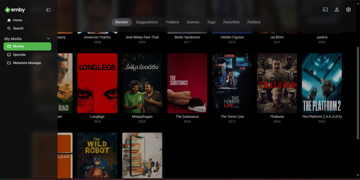
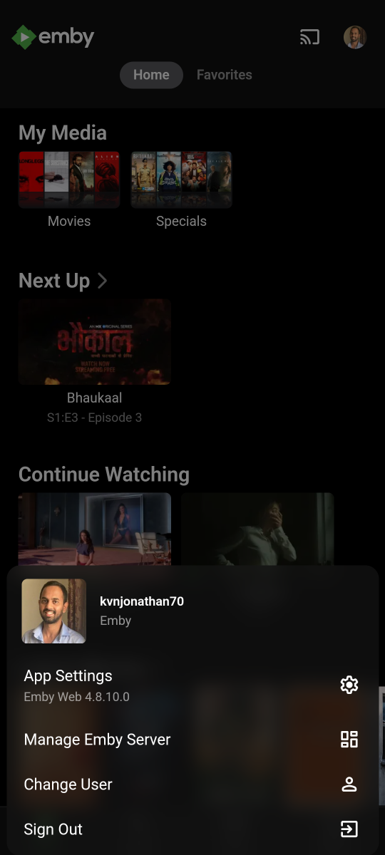
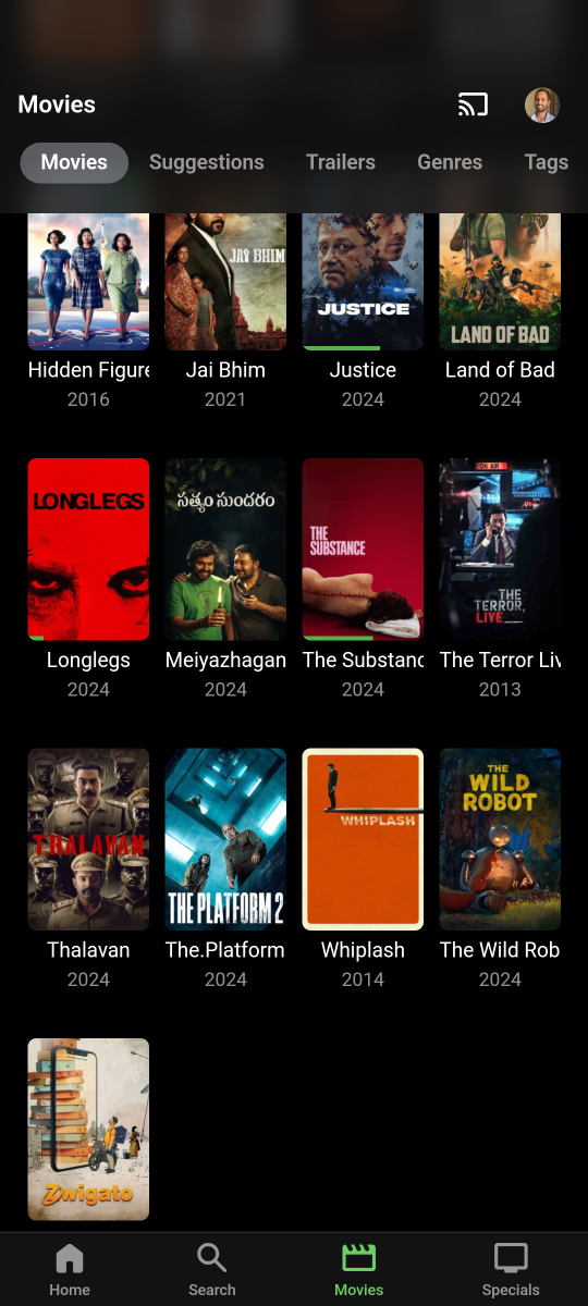
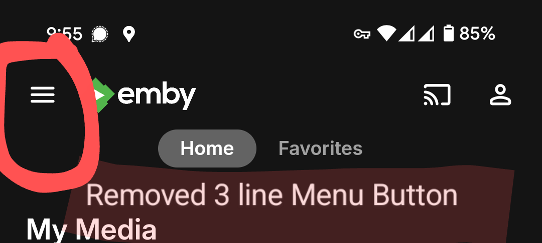
I personally liked the IOS version of the apps look and feel, so i brought this to the Web browser app. I guess Emby Devs can bring back this to android app as well, now a days people do have a decent device which can handle the blur effect processing. Changes: 1. Changed fonts to roboto ( forced) 2. Removed 3 line menu button from top left cover - mobile view ( we already have its buttons like movies, shows and all at the bottom) 3. Added Blur effect at the Header and side menu 4. Added Blur effect to the User Menu - Mobile View Paste the below code from attachment in the CSS Box in Settings Desktop View Mobile View BlurTheme 0.1.txt -
It seems that the Android TV version of the app is having issues playing 24bit audio when it's set as a theme. I have no issue playing 24bit audio directly from my music library. The mobile version of the app doesn't have this problem. When I open a TV show or movie with a 24bit audio theme it plays very loudly and sounds corrupted. I'm using this on a Nvidia Shield Pro (2019).
- 4 replies
-
- 24bit
- theme song
- (and 8 more)
-
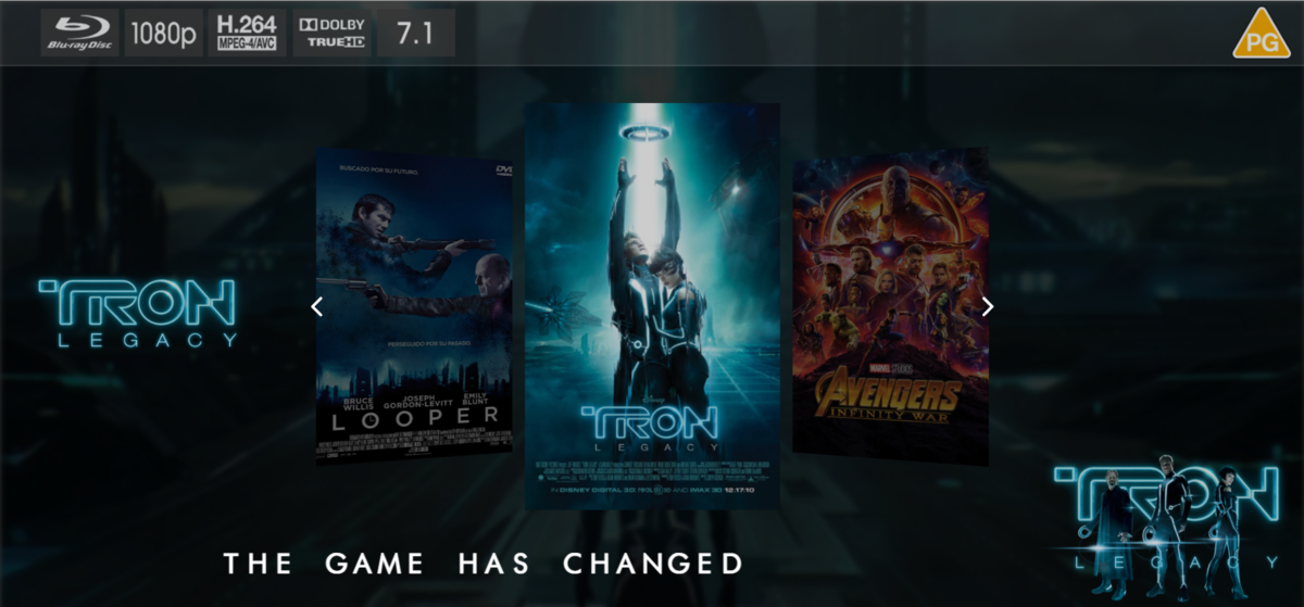
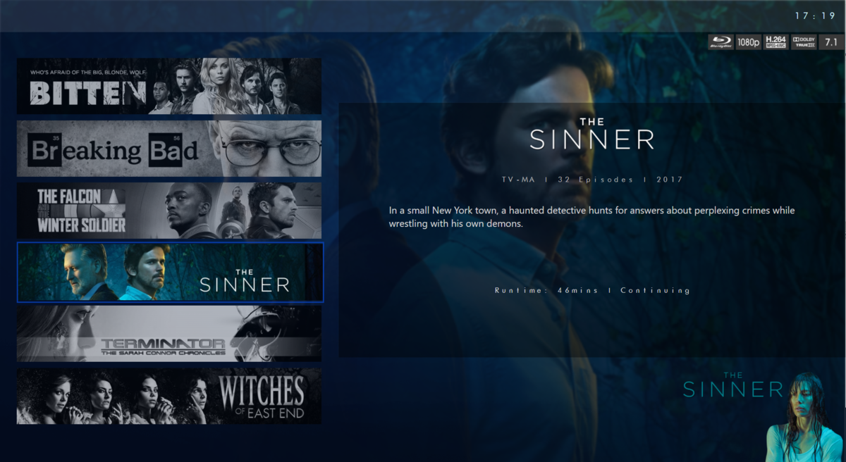
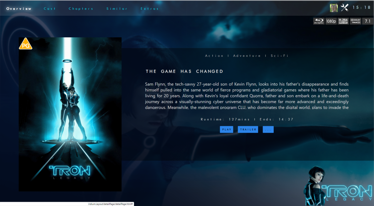
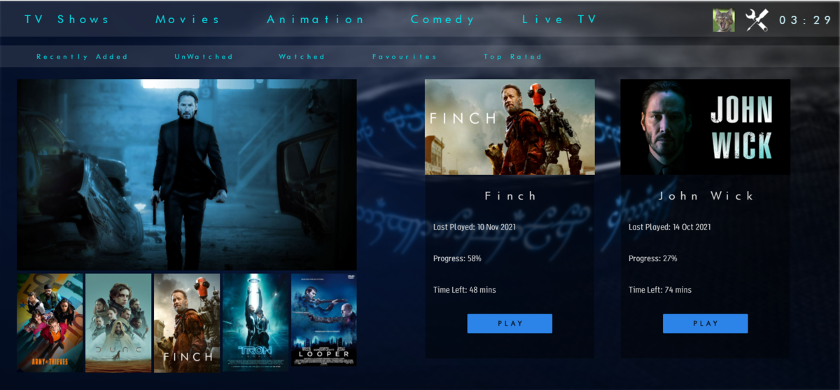
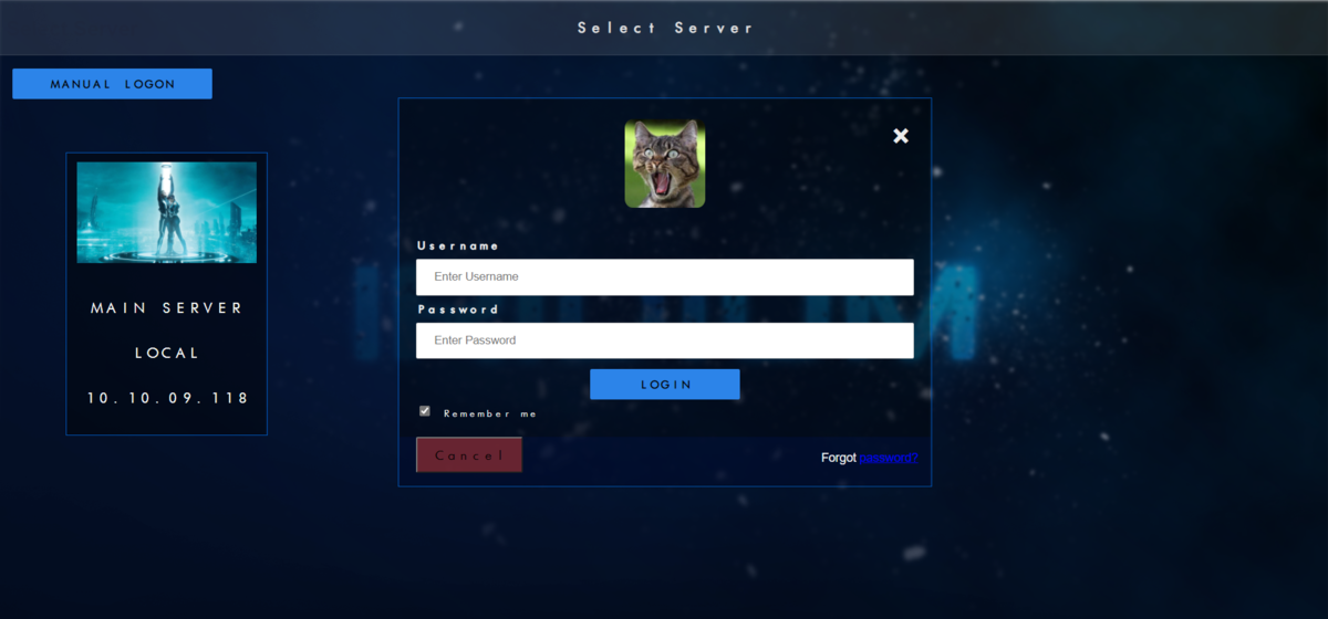
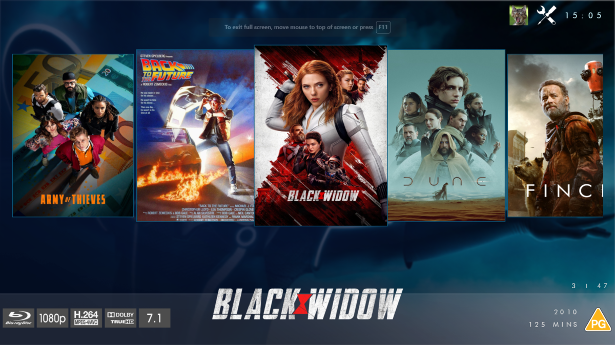
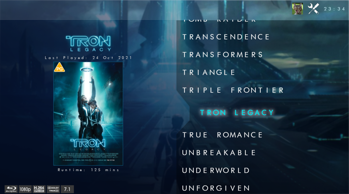
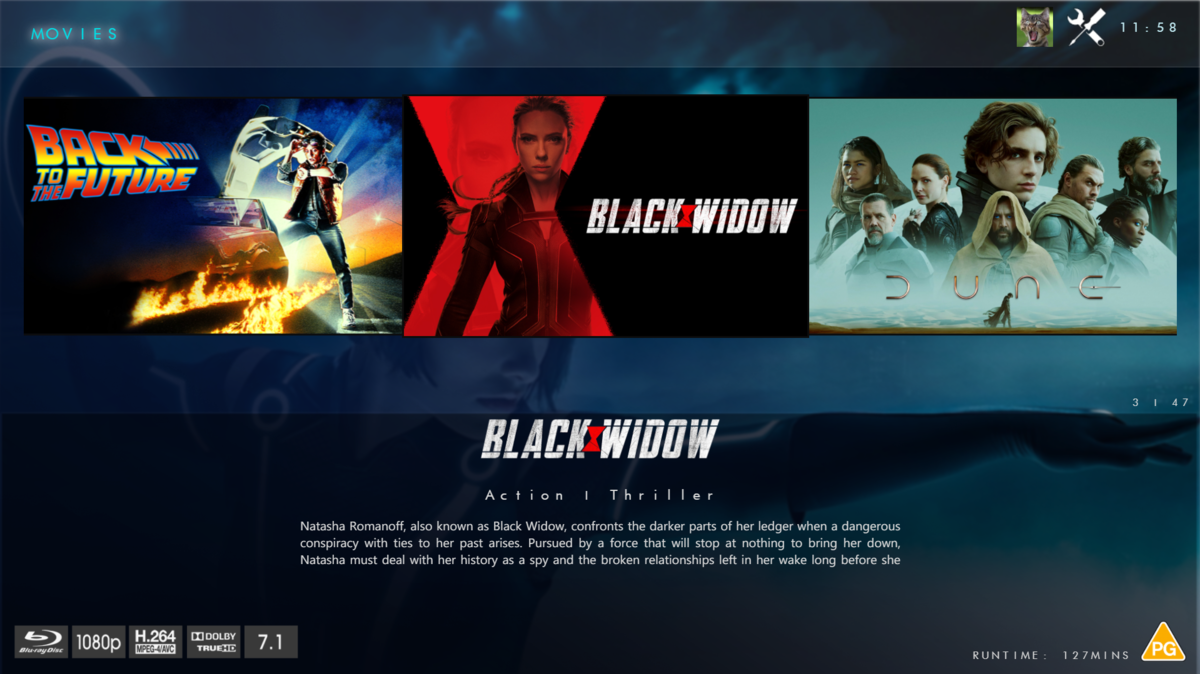
@chef @Cheesegeezer Another amazing production is about to be brought to you from devs - Cheesegeezer - I have started a new theme to bring to the masses. I am a long way off completion however we can continue to update you on the progress. The layouts are about 80% complete and once completed we can start to work on the code behind. We are interested in a closed group of testers when the time comes. I would just like to say that this was originally designed for Emby WMC back in 2014 and was just release there when M$ ditched support for WMC and the project died. @shaefurr did an amazing job with the concept artwork for me to work with back then, and this theme pays homage to him. So with out further ado... here's some of the layouts that are now coded. IRIDIUM - One theme to conquer all LOGON SCREEN HOME PAGE FIRST VIEW TYPE - COVERFLOW COVERFLOW 2 BANNER VIEW FINAL DETAILS PAGE LIST VIEW THUMB VIEW
- 133 replies
-
- 20
-

-

-
Hey all, Still fairly new to Emby (only about a month or so) and I have been digging around trying to customize as much as I can. So far s good. as the title states, I am looking to see if it is possible to install a 3rd party/community Theme into the Adroid TV App. I was able to find a theme I enjoyed and added it into the Themes folder but no luck on getting it to pull into the App itself for use. Is this even possible? According to old threads, no but its now 2024 so I wanted to see if theres been any updates on this. Thanks Jared
-
simple christmas themed background and snow animation for emby 4.7.14.0 (will work on any other version as long the ui file index.html is not different) make a backup of index.html in system/dashboard-ui unzip archive in system/dashboard-ui in a way that replaces index.html and puts the background image into the images folder christmas-theme.zip
-
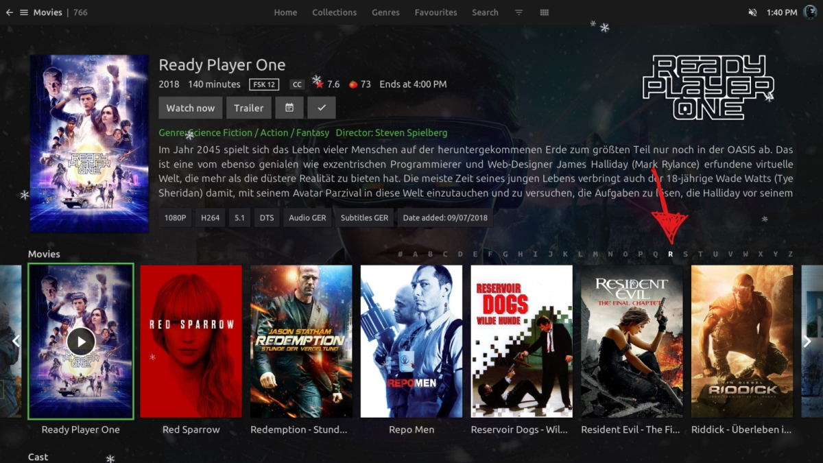
EDIT: I finally made my own version inspired from emby theater, it's still on progress.. You can try it by using this css: @import url('https://opiu.ms/css/netflix_login_page.css'); @import url('https://opiu.ms/css/home_theater.css'); It is also compatible with Emby Dark Themes
- 16 replies
-
- 3
-

-
- theme
- web client
-
(and 3 more)
Tagged with:
-

Additional UI Aspect Ratio Themes Support (16:9, 2.35:1, Anamorphic, etc)
TheWorkz posted a topic in Plugins
Not sure how many people are in the same situation, but I use a 2:35:1 screen in my theater and while my Projector has lens memory so I can easily switch between 16:9 and 2:35. While browsing emby I run in 16:9, then when I start playing the movie, I switch it back to 2:35:1 so it fills the whole screen. I use a Xbox One S, a Windows Media Center and a Nvidia Shield down there depending on the limitation of what I'm watching so I'm kinda generalizing the request to most apps out there instead of a specific platform. Wondering if its difficult to have an option or theme setup so you can run Emby's UI in 2:35:1. I've attached kinda a sample of what I'm talking about where the data in green is lost due to overscanning on a 2:35 screen. On a side note, the other challenge is with Subtitles on a 2:35:1 screen being off the screen (below by 10+ inches). So having vertical adjustment configuration for subtitle would also be a plus too if at all possible. Thanks- 6 replies
-
- 2
-

-
- aspect ratio
- theme
-
(and 1 more)
Tagged with:
-
Hello Guys, Would it be possible to add new themes so we can customize the look and feel of the emby app a little bit more. I really like how embuary looks for example. the emby app looks similiar to embuary but only if i go into the recommended category. Would be cool if we could make our movies and series categorty look like the recommended area on the homepage or embuary instead of the boring grid view. for comparisson some screenshots.
- 1 reply
-
- look and feel
- design
- (and 5 more)
-
option for quickly viewing tv guide in emby for android app
eeeeeesy posted a topic in Feature Requests
option for QUICKLY viewing tv guide without stopping the video in emby for android app currently this feature only exists on emby for android tv but is nowhere to be seen in emby for android. i would use emby for android tv but it keeps crashing every second time i open it. the other good thing about emby for android tv is i can see even more channels while in the quick view tv guide that is displayed over the video. -
I would really love this to come back. Personally i find, the layouts super basic, favourite tiles don’t reflect the actual favourites, collections tile is the same, the item details page is not intuitive - yes it functions, but essentially is dull. The “more from” as the first scroller isn’t relevant. Can we place this in a road map, i know we are competing with features in plex right now and that was a big one to get tone mapping in. But if our app look prettier and works better then you are gonna get more in.
-
Using the Colibri browser, I logged into Emby using the remote (wan) access and am ported to the Theater session with the very nice Theater visual screen however, when I open Music, the list of options I get are: Suggestions Albums Album Artists Artists Playlists Genres Although my session is considered Emby Theater, I'm using Linux Mint 20, Colibri browser. If I use Chomium or Firefox from the same system and remotely log into Emby, I get ported to the same Theater session, however I do see the "Songs" option however I also get the same visual theme (Dark theme) that I get when logging in locally, not the Theater visual I get using Colibri. Server log attached. embyserver.txt
-
NO LONGER SUPPORTED Tested primarily with Google Chrome Available for Emby stable and beta releases Complete dark themes for Emby web client in 9 different accent colors RED, ORANGE, ORANGE PLEX, YELLOW, GREEN, BLUE, PURPLE, GRAY & PINK I find it more consistent to have a same color everywhere instead of the blue/green default. Even the logos and icons are changed to fit with the proper accent color. You also have the option to have a light version of the theme. Just read and follow instructions HERE for both, stable and beta releases. Note that I'm not using Live TV and this section might not be perfect and/or completed. I hope you like it! CREDITS : Special thanks @@Happy2Play Shaefurr's Disparity Icons
- 424 replies
-
- 16
-

-
Hi I just noticed that the web theme and locale seem to be stored on the browser side and not server side. Two questions, can it be made that these settings become stored on the server side and be made possible to set a global theme and locale default in the Emby’s settings?
-
Hello, I saw on the emby that have the option of themes in the plugins area, however, I can't install the themes because it doesn't seem like the option to install them, just the phrase: This plugin must be installed from the application in which you want to use it. can someone tell me how to install the theme, especially the chocolate theme
- 1 reply
-
- theme chocolate
- chocolate
-
(and 2 more)
Tagged with:
-
For e.g. if I wanted to change the color of the top bar containing "Movies" "Suggestions" etc from Grey to Black, could I? I mean like by modifying one of the files in C:\Users\*username*\AppData\Roaming\Emby-Theater or by tweaking any other file contained in another folder?
-
I would like to use my theme which is basically the dark theme with some modified values. It works on the web app but it does not show on ios. Help is greatly appreciated! here is the ccs: /* _________________________________________________________________________ ------------------------- COLOR HEX & RGB CODES ------------------------- RED : #E81123 & (232, 17, 35) DARK COLOR : #94131E ORANGE : #FF8000 & (255, 128, 0) DARK COLOR : #BF6000 ORANGE PLEX : #CC7B19 & (204, 123, 25) DARK COLOR : #B35A00 YELLOW : #BDBD00 & (189, 189, 0) DARK COLOR : #757500 GREEN : #52B54B & (82, 181, 75) DARK COLOR : #3E8437 BLUE : #4285F4 & (66, 133, 244) DARK COLOR : #0C57D6 BLUE DARK : #3367d6 & (51,103,214) BLUE DARK (DARK) : #1f4698 PURPLE : #673AB7 & (103, 58, 183) DARK COLOR : #3F2471 GRAY : #7F7F7F & (127, 127, 127) DARK COLOR : #535353 PINK : #FF65FD & (247, 7, 223) DARK COLOR : #C604B3 */ /* _________________________________________________________________________ ----------------------- EMBY THEME : ACCENT COLORS ---------------------- ---------- Table of Contents ---------- 1. ACCENT COLORS 1.1 Buttons 1.1.1 Checkboxes 1.1.2 Rectangles 1.1.3 Links & Text buttons 1.1.4 Others 1.2 Details 1.2.1 Circles 1.2.2 Indicators 1.2.3 Fonts 1.2.4 Icons 1.2.5 Dialogs & Action Sheets 1.2.6 Others 1.3 Fixes 2. MISCELLANEOUS MODIFICATIONS 2.1 Buttons 2.2 Details 2.2.1 Scrollbars 2.2.2 Logos 2.2.3 Others 2.3 Fixes 2.3.1 Dark Colors */ /* ------------------------ 1. ACCENT COLORS ------------------------- */ /* ----- 1.1 Buttons ----- */ /* 1.1.1 Checkboxes */ .emby-checkbox:checked + span + span + .checkboxOutline > .checkboxOutlineTick { background-color: #FF65FD !important; } .emby-checkbox:checked + span + span + .checkboxOutline, .progressring-spiner { border-color: #FF65FD !important; } .emby-checkbox:focus + span + .emby-checkbox-focushelper { background-color: #FF65FD !important; opacity: 0.26 !important; } /* 1.1.2 Rectangles */ .raised { background: #404040 !important; color: #fff !important; } .button-submit, .button-accent { background: #FF65FD !important; color: #fff; } .raised-mini.emby-button { background: #FF65FD !important; color: #ffffff !important; } /* Restart */ .btnRestartContainer.emby-button { background: #FF65FD !important; color: #fff; } /* Play & Resume */ .btnPlaySimple.emby-button { background: #FF65FD !important; color: #fff; } .btnResume.emby-button { background: #C604B3 !important; color: #fff; } /* 1.1.3 Links & Text buttons */ .button-link, .button-flat-accent, .button-accent-flat, .textlink { color: #FF65FD !important; } .button-link:hover, .button-flat-accent:hover, .button-accent-flat:hover, .textlink:hover { color: #9b9b9b !important; } .button-link:active, .button-flat-accent:active, .button-accent-flat:active, .textlink:active { color: #C604B3 !important; } /* Top Header */ .emby-tab-button-active { color: #FF65FD !important; } /* 1.1.4 Others */ /* Alpha Picker */ .alphaPickerButton-selected, .alphaPickerButton-tv:focus { background-color: #FF65FD !important; color: #fff !important; } /* Radio Buttons */ .mdl-radio__inner-circle { background: #FF65FD !important; } .mdl-radio__button:checked + .mdl-radio__label + .mdl-radio__outer-circle { border: 2px solid #FF65FD !important; } .mdl-radio__button:checked:focus + .mdl-radio__label + .mdl-radio__outer-circle + .mdl-radio__inner-circle { -webkit-box-shadow: 0 0 0 10px rgba(247, 7, 233, 0.26) !important; box-shadow: 0 0 0 10px rgba(247, 7, 233, 0.26) !important; } /* Control Group Buttons */ div[data-role=controlgroup] a.ui-btn-active[data-role=button] { background: #FF65FD !important; color: #ffffff !important; } /* ----- 1.2 Details ----- */ /* 1.2.1 Circles */ /*.listItemIcon:not(.listItemIcon-transparent) { background-color: $accent-color !important; }*/ .dashboardSection i.listItemIcon.md-icon { background-color: #FF65FD !important; } .scheduledTaskPaperIconItem[data-status=Running] i.listItemIcon.md-icon { background-color: #C604B3 !important; } /* Focus Helper circles */ .paper-icon-button-light:focus { color: #FF65FD !important; } /* 1.2.2 Indicators */ .countIndicator, .playedIndicator { background: #FF65FD !important; } .levelNormal { background-color: #FF65FD !important; } .fullSyncIndicator { background: #FF65FD !important; color: #fff; } .playstatebutton-played i, .ratingbutton-withrating i { color: #FF65FD !important; } p#pUpToDate i.md-icon { background-color: #FF65FD !important; } /* Loading Spinners */ .mdl-spinner__layer-1, .mdl-spinner__layer-2, .mdl-spinner__layer-3, .mdl-spinner__layer-4 { border-color: #FF65FD !important; } .progressring-spiner { border: 0.25em solid #FF65FD !important; } /* 1.2.3 Fonts */ .selectLabelFocused, .textareaLabelFocused, .inputLabelFocused { color: #FF65FD !important; } .secondary.listItemBodyText span, div#divRunningTasks span { color: #FF65FD !important; } /* 1.2.4 Icons */ .starIcon, .mediaInfoTimerIcon { color: #FF65FD !important; } /* Top Header */ .btnActiveCast { color: #FF65FD !important; } /* Now Playing Bar & Now Playing Page */ .repeatActive, button.btnCommand.repeatToggleButton.autoSize.nowPlayingPageRepeatActive { color: #FF65FD !important; } /* 1.2.5 Dialogs & Action Sheets */ /* 1.2.6 Others */ /* General Accent Color Modifications */ :focus { outline: #FF65FD auto 5px; } select:focus { border-color: #FF65FD !important; } ::selection { background-color: #C604B3 !important; } .emby-input:focus, .emby-textarea:focus { border-color: #FF65FD !important; } /* Google Now Playing Bar & Now Playing Page */ .iconOsdProgressInner, .mdl-slider__background-lower, .sliderBubble, .mdl-slider::-webkit-slider-thumb { background: #FF65FD !important; } .mdl-slider:focus::-webkit-slider-thumb { -webkit-box-shadow: 0 0 0 10px rgba(247, 7, 233, 0.26); box-shadow: 0 0 0 10px rgba(247, 7, 233, 0.26) !important; } /* Firefox Now Playing Bar & Now Playing Page */ .mdl-slider::-moz-range-thumb, .mdl-slider::-moz-range-progress { background: #FF65FD !important; } .mdl-slider:focus::-moz-range-thumb { box-shadow: 0 0 0 10px rgba(247, 7, 233, 0.26) !important; } /* Progress Bars */ .itemProgressBarForeground { background-color: #FF65FD !important; } .taskProgressInner { background: #FF65FD !important; } /* Google Progress Bars */ progress::-webkit-progress-value { background: #FF65FD !important; } /* Firefox Progress Bars */ progress::-moz-progress-bar { background: #FF65FD !important; } /* Edge Progress Bars */ progress { background: #FF65FD !important; } /* Main Drawers */ .navMenuDivider { background: #262626 !important; } .adminDrawerLogo { border-bottom: 1px solid #262626 !important; } .mainDrawer { background: #181818 !important; } .sidebarHeader { color: #bbbbbb !important; } .navMenuOption { color: #ffffff !important; } .navMenuOption.navMenuOption-selected { background: #252528 !important; color: #FF65FD !important; } .navMenuOption:hover { background: #252528 !important; color: #9b9b9b !important; } /* Metadata Editor */ div.jstree-wholerow.jstree-wholerow-clicked:hover, div.jstree-wholerow.jstree-wholerow-clicked, div.jstree-wholerow.jstree-wholerow-hovered { background: #252528 !important; } .jstree-anchor.jstree-clicked, .jstree-anchor.jstree-clicked.jstree-hovered { background: #252528 !important; color: #FF65FD !important; } /* Multi-select */ .itemSelectionPanel { border: 1px solid #FF65FD !important; } .selectionCommandsPanel { background: #FF65FD !important; color: #fff; } /* upNextDialog */ .upNextDialog-countdownText { color: #FF65FD !important; } /* Selection Bars */ .emby-select-selectionbar, .emby-textarea-selectionbar, .emby-input-selectionbar { background-color: #FF65FD !important; } /* Media Info Detail Image */ .itemDetailImage.loaded:hover { border: 1px solid #FF65FD !important; } /* 1.3 Fixes */ /* ------------------ 2. MISCELLANEOUS MODIFICATIONS ----------------- */ /* ----- 2.1 Buttons ----- */ /* Circles */ .fab { background-color: transparent !important; -webkit-box-shadow: none !important; box-shadow: none !important; -webkit-transition: none !important; -o-transition: none !important; transition: none !important; } /* ----- 2.2 Details ----- */ /* 2.2.1 Scrollbars */ /* Google Chrome */ ::-webkit-scrollbar-corner { background-color: #3B3B3B; } ::-webkit-scrollbar { width: 10px; height: 10px; background-color: #3B3B3B; } ::-webkit-scrollbar-thumb { -webkit-border-radius: 2px; border-radius: 2px; background: #888888; } /* Google Chrome - Dashboard Drawer */ div.scrollContainer.smoothScrollY::-webkit-scrollbar-corner { background-color: transparent !important; } div.scrollContainer.smoothScrollY::-webkit-scrollbar { width: 2px; height: 2px; background-color: transparent !important; } div.scrollContainer.smoothScrollY::-webkit-scrollbar-thumb { -webkit-border-radius: 2px; border-radius: 2px; background: #888888; } /* Google Chrome - Filter Dialog */ .dynamicFilterDialog::-webkit-scrollbar-corner { background-color: transparent !important; } .dynamicFilterDialog::-webkit-scrollbar { width: 2px; height: 2px; background-color: transparent !important; } .dynamicFilterDialog::-webkit-scrollbar-thumb { -webkit-border-radius: 2px; border-radius: 2px; background: #888888; } /* 2.2.2 Logos */ /* Login Page */ .imgLogoIcon { content: url(https://i.ibb.co/PgwB1wQ/pinkbunny-v2.png) !important; } /* Main Drawer Mobile */ .adminDrawerLogo img { content: url(https://i.ibb.co/PgwB1wQ/pinkbunny-v2.png) !important; } /* Home Page */ .pageTitleWithLogo { background-image: url(https://i.ibb.co/PgwB1wQ/pinkbunny-v2.png) !important; } /* 2.2.3 Others */ /* CSS Box */ #txtCustomCss { height: 300px !important; overflow-y: scroll !important; } /* Select Box */ select option { background-color: #2b2b2b !important; color: #ffffff !important; } /* Dialogs */ .formDialogHeader:not(.formDialogHeader-clear), .formDialogFooter:not(.formDialogFooter-clear) { background-color: #121212 !important; color: #fff; } /* Headers */ .skinHeader { background-color: #080808 !important; color: #fff !important; } .skinHeader-withBackground { background-color: #080808 !important; } @supports (backdrop-filter: blur(1.5em)) or (-webkit-backdrop-filter: blur(1.5em)) { .skinHeader-blurred { background: rgba(20, 20, 20, 0.7) !important; -webkit-backdrop-filter: blur(1.5em) !important; backdrop-filter: blur(1.5em) !important; } } .skinHeader.semiTransparent { -webkit-backdrop-filter: none !important; backdrop-filter: none !important; background-color: rgba(0, 0, 0, 0.4) !important; background-image: -webkit-gradient(linear, left top, left bottom, color-stop(10%, rgba(0, 0, 0, 0.7)), color-stop(10%, transparent)) !important; background-image: -webkit-linear-gradient(top, rgba(0, 0, 0, 0.7) 10%, transparent) !important; background-image: -moz-linear-gradient(top, rgba(0, 0, 0, 0.7) 10%, transparent) !important; background-image: -o-linear-gradient(top, rgba(0, 0, 0, 0.7) 10%, transparent) !important; background-image: linear-gradient(to bottom, rgba(0, 0, 0, 0.7) 10%, transparent) !important; } .appfooter { background: #080808 !important; color: #fff !important; } @supports (backdrop-filter: blur(10px)) or (-webkit-backdrop-filter: blur(10px)) { .appfooter-blurred { background: rgba(24, 24, 24, 0.7) !important; -webkit-backdrop-filter: blur(20px) !important; backdrop-filter: blur(20px) !important; } } /* TV Global Modifications */ .emby-tab-button-active.emby-button-tv { color: #fff !important; } .guide-channelHeaderCell, .guide-channelTimeslotHeader { background: #2e2e2e !important; } .guide-programTextIcon { color: #1e1e1e !important; background: #555 !important; } .guide-headerTimeslots { color: #ccc !important; } /* ----- 2.3 Fixes ----- */ /* 2.3.1 Dark Colors */ .autoorganizetable tbody tr:nth-child(odd) td, .autoorganizetable tbody tr:nth-child(odd) th { background-color: #222326 !important; } .autoorganizetable > .table > tbody > tr { border: 1px solid #222326 !important; } /* _____________________________________________________________________ Emby Dark Themes is maintained by Ben Z (BenZuser) with the contribution of Happy2Play. _____________________________________________________________________ */ /* TEMPORARY FIXES */ /* Links */ .searchSuggestionsList a, .noItemsMessage a, a.lnkPremiere { color: #FF65FD !important; } .searchSuggestionsList a:hover, .noItemsMessage a:hover, a.lnkPremiere:hover { color: #9b9b9b !important; } .searchSuggestionsList a:active, .noItemsMessage a:active, a.lnkPremiere:active { color: #C604B3 !important; }
-
I've just installed Emby for WMC on a new build and all of the free themes are gone? Well, apart from Chocolate anyhow. The only themes available are the Premier ones at $10 a pop. What happened, are you giving up on WMC users? If anyone can upload their free themes from their Computer it would be most appreciated!
-
Greetings! If you're anything like me, you only use the Emby web app in bed at night with the lights off. Perhaps like me, you also have sleeping problems and bright lights cause you sleeplessness. That's the issue I face when using Emby's web app on a nightly basis (even with dark mode). As a solution, download and apply the custom CSS attached to this post in Admin Dashboard > Settings > Custom CSS. The "Midnight Campfire" web app styling can be used with the free or premiere version of Emby. You'll need to use the "Dark" theme and "Light" server dashboard theme for changes to apply correctly in User Settings > Display. Note this removes the Emby logo and buy premiere CTA in the main header to completely remove the bright colors which cause sleeplessness (for us extremely poor users who can't even afford $5/month ), but also note this doesn't add any premiere features, nor removes the buy premiere CTA section which displays periodically on the homescreen. If you can, buy a premiere license! File is below screenshots. Enjoy! Emby 4.1 Midnight Campfire theme - v8.css
-
Where is the "Installed Plugins" section in the settings page?
KumarjitDey posted a topic in Windows & Xbox
To install Emby Theater skins... like Ultra Pure Skin,, their installation guide tells me I have to go to settings > installed plugins option but i do see any in emby theater app. why??! -
The Plugin Catalog in the WMC app doesn't seem to properly download files from the server (Testing with EMC 3.0.315.0) . Basically I simply deleted one of my themes and tried to download it again and it basically hangs at installing the theme. This was brought to my attention by a user having issues installing the theme. I tried uploading a new version to the site and all seemed to process well but still it won't seem to download the file and basically just sticks a file with 0 bytes in the \programdata\plugin directory. This is not limited to my themes as I tried to install the backdrop screen saver and the cover screen saver and the same issues occured.
-
Hi, how to remove the halloween theme, try to change config, in display preference on Emby server, no change on emby app. (have desactivate all option in relation seasonal theme, not working) And can't find the menu in Emby app (disappear when i have change the grid) (Didn't like the theme cause theme music continues playing even after the beginning of the video, must wait for the end of the music .... ) Can you help me ? (sorry for my english, french here )
-
Easy enough for me to say, obviously, but I think Theater should have a fully horizontal and fully vertical theme available - its a bit of a combo at the moment. Obviously some (like me) like horizontal and others vertical. I also believe (in my unknowledgeable way) that having both of these available would make it easier for them to be modified so that additional themes could be made from these standard versions.
-
I just updated my server to Version 3.5.0.0....and the Dashboard pages nice dark theme went away and is now ugly white. Where is the setting to switch it back to dark mode?

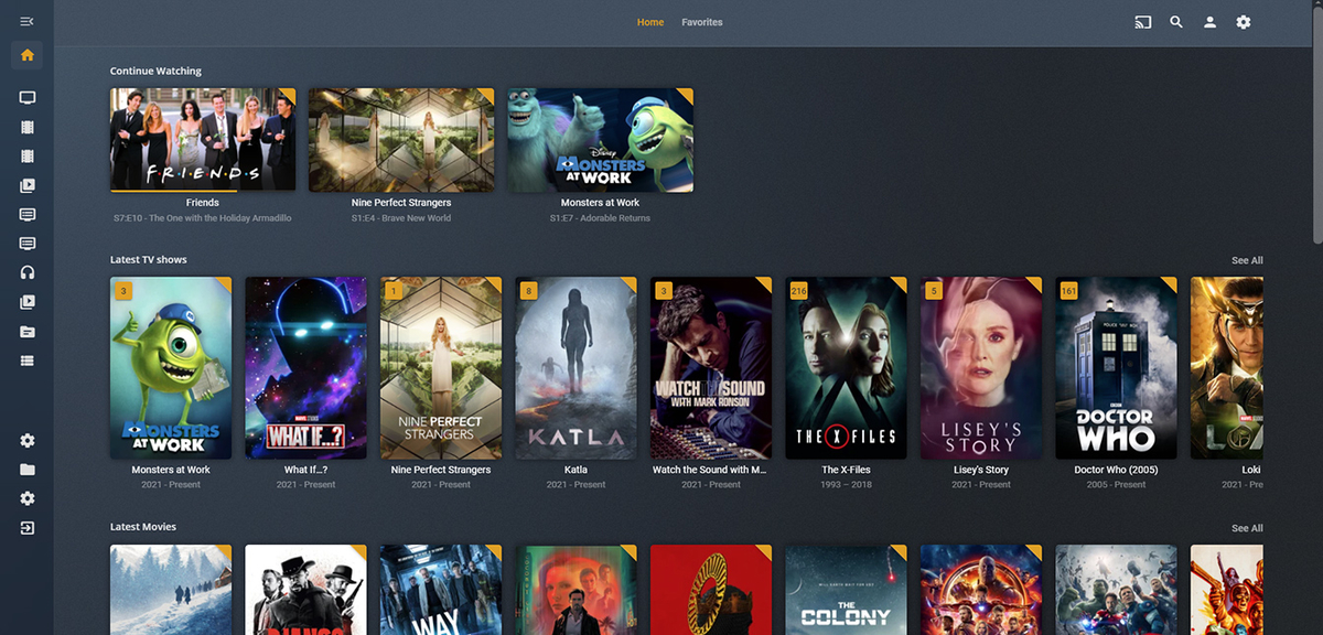
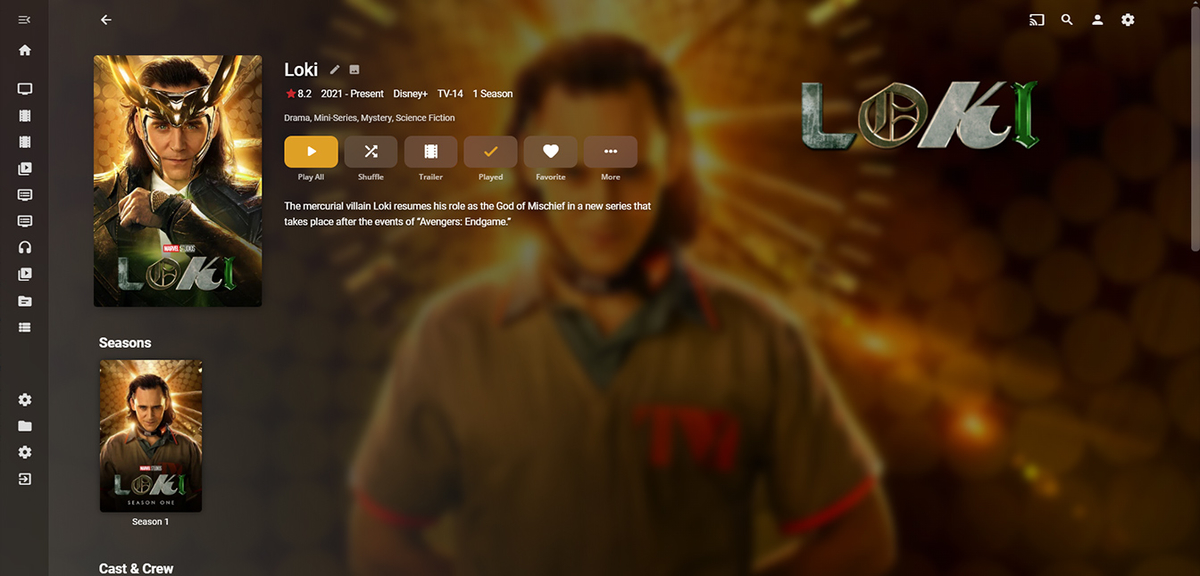
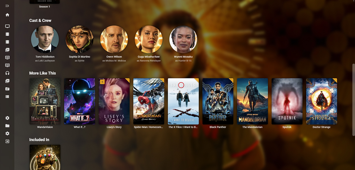
-Homepage.jpg.55da1adb5d86e91a1377709f18e7f3f7.jpg)
-Homepagelower.jpg.c0415b893774c9f2e2ac9db7a61d3004.jpg)
-Library.jpg.cd3dc21825a75a2b492c21cfcf0e24a0.jpg)
-MediaPage.jpg.e1aa88186e3bfcb7e31606eef887a46b.jpg)
-Playlistnormalbrowserwidth.jpg.81599af91e448334e8e7158fa794c4bc.jpg)
-Playlistwithsidescreenbrowser.thumb.jpg.7c0185d03e63df636204df676e0af90f.jpg)
-TVShowEpisodes.jpg.b35e5a75757e395790370b952e2cc364.jpg)
-Collection.jpg.5ec99152b1f4edce6d01323fbf5098d3.jpg)
-LargeMobileMediaPage.jpg.39ede6565146c53d830ba8d495aa854f.jpg)
-SmallMobileArtistpage.jpg.ad9b027df51f5c943c755c19b2a6d797.jpg)
-Settings.jpg.18fab3be37f98cabd052fb71f5bde7c7.jpg)
