Search the Community
Showing results for tags 'interface'.
-
I recently downloaded Plex to see what it looks like nowadays and I was impressed with how it manages libraries. I root user can have access to all the libraries. However, the home screen can show only the pinned libraries. This is great! I want to havre access to three or four main libraries and hide the rest of the libraries. At the same time I can search for content from all of the libraries and if needed quickly access them. Can this be done with Emby?
-
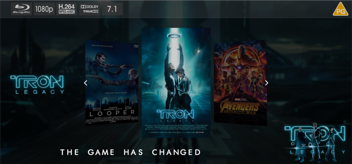
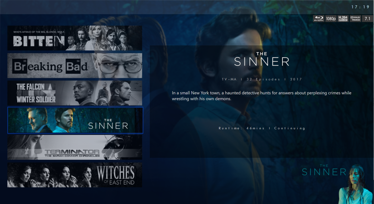
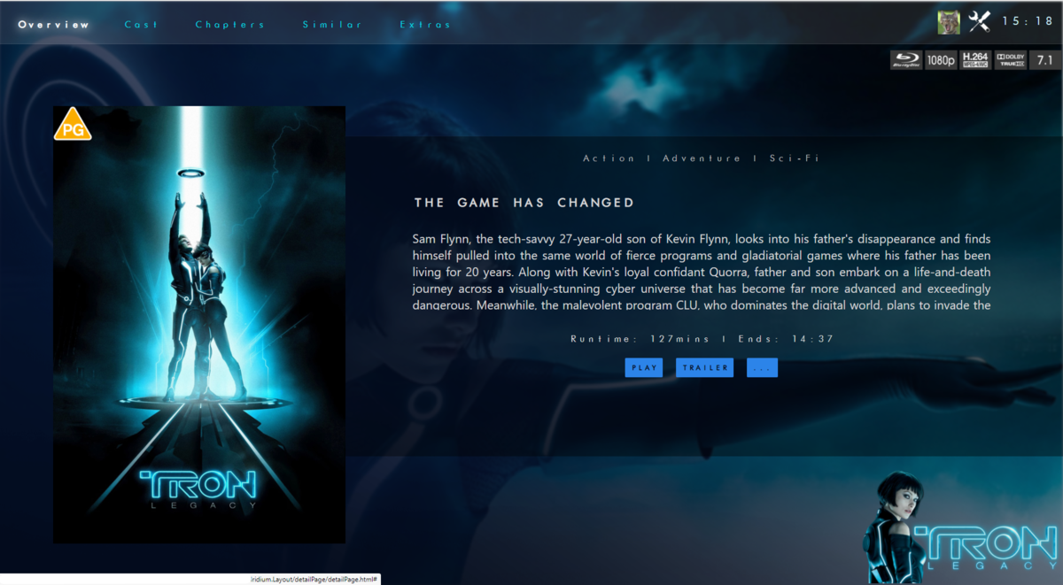
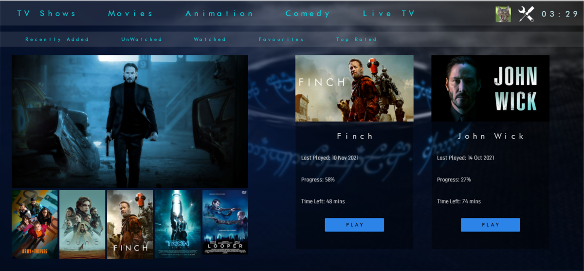
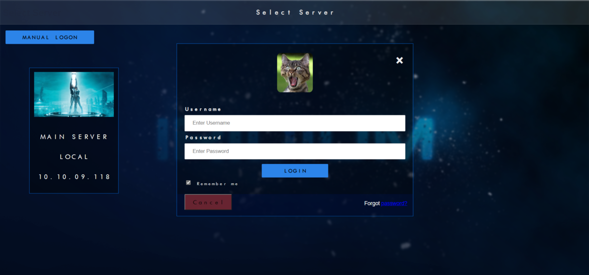
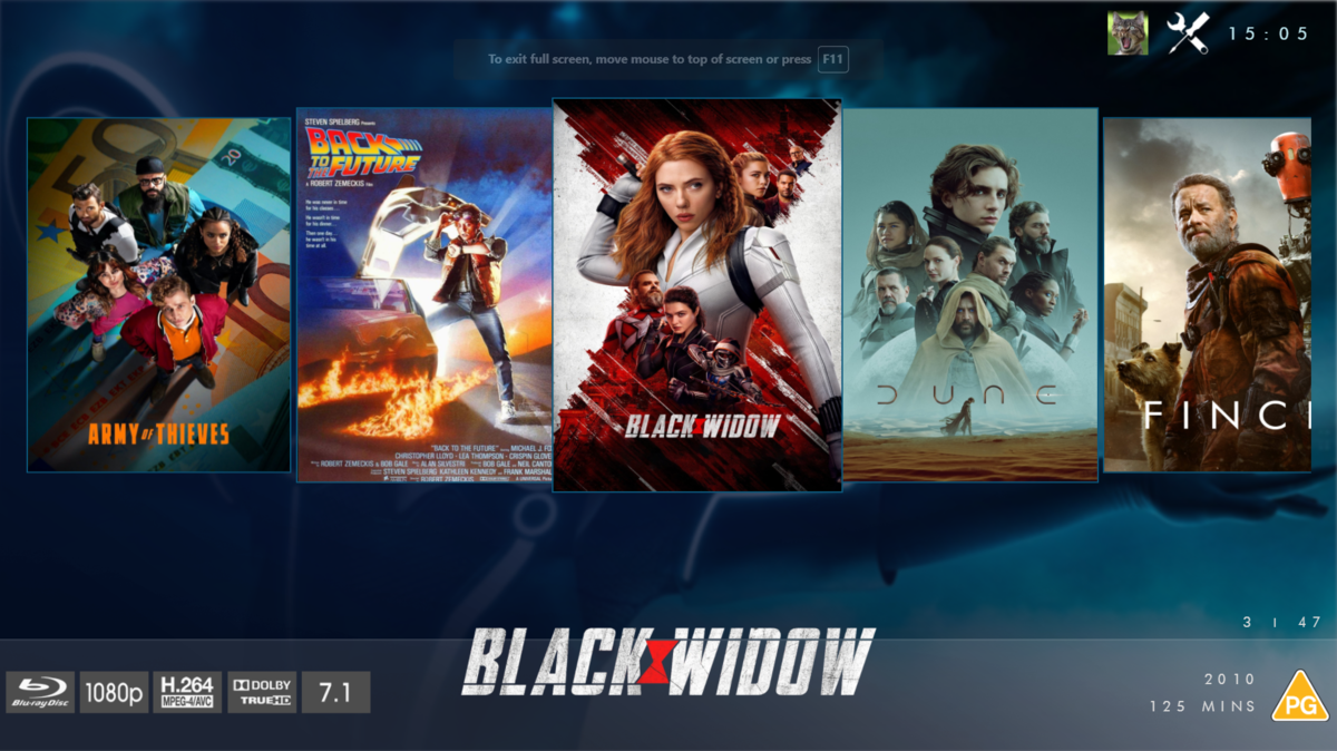
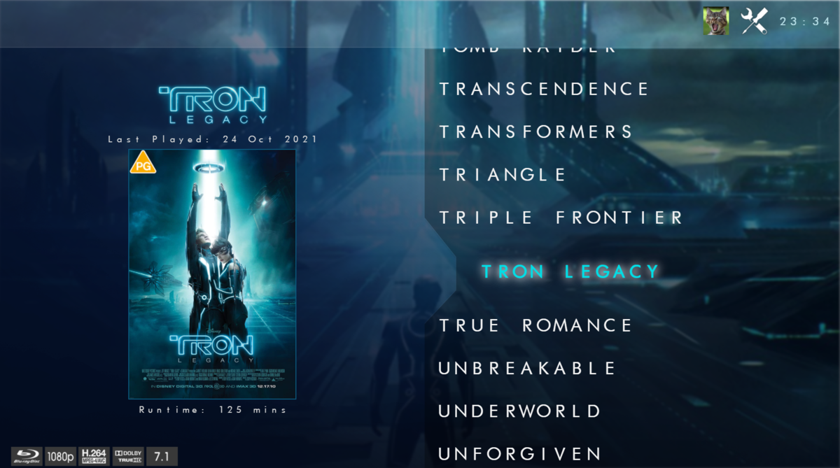
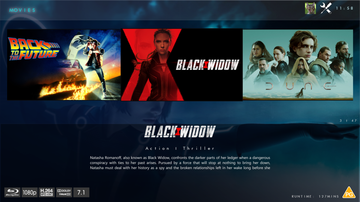
@chef @Cheesegeezer Another amazing production is about to be brought to you from devs - Cheesegeezer - I have started a new theme to bring to the masses. I am a long way off completion however we can continue to update you on the progress. The layouts are about 80% complete and once completed we can start to work on the code behind. We are interested in a closed group of testers when the time comes. I would just like to say that this was originally designed for Emby WMC back in 2014 and was just release there when M$ ditched support for WMC and the project died. @shaefurr did an amazing job with the concept artwork for me to work with back then, and this theme pays homage to him. So with out further ado... here's some of the layouts that are now coded. IRIDIUM - One theme to conquer all LOGON SCREEN HOME PAGE FIRST VIEW TYPE - COVERFLOW COVERFLOW 2 BANNER VIEW FINAL DETAILS PAGE LIST VIEW THUMB VIEW
- 133 replies
-
- 20
-

-

-
Aloha! I would like give a couple of thoughts on the IOS App Design. So far I like it, does what it should do, but a couple of things might be worth rethinking. The Bottom Bar - It would be really neat to make this bar customizable. I need different sections on my iPad than i need on my phone so letting me choose what to put there would be a real treat. Downloads Tab - I would like to ask the question if the "Downloads" tab is needed at all because I think it could be integrated into the standard overview, for video and audio. You could show what is downloaded with a little coloured emblem on a record or movie in the general library overview and make Emby prefer a downloaded file over a streamed one (optional) so there would be no need to show downloads as a tab or make this optional for people who still want the tab. Deleting the downloads is already kinda solved this way because i can do it from the main library, I don't even have to switch to the download tab, when it works. All in all, the Netflix design, as far as I remember. Volume Adjustment - This is a remote / Lock Screen issue. When I use the IOS App as a remote control for my browser I have to go into the app to adjust the volume of playback. That sucks a little and leads me to the next thing. It's a pity that you can not adjust volume at all via the lock screen navigation bar. It is a little maddening that you can use play next/before arrows but not the volume slider. It would be a dream come true to make the buttons/lock bar interface the general way of controling whatever instance of Emby is playing at the moment. Volume Slider - In general it would be nice if the volume slider was live. Maybe thats not how Emby works and this is not possible, but just as a thougth it would be VERY comforting to hear on what level you put the volume while you do it and not afterwards. Most apps do this so I thought lets try to mention it. One other small thing is the volume slider in IOS on phones in vertical mode. It doesn't scale very well because it is really small and touches the outer ends of my screen. I put a screenshot in the attachments. Maybe there is an option to make it pop up vertically, that would solve the problem in every mode and on every device. I hope thats some valuable input! I put this all together in one thread, I hope thats Ok. All the best! EDIT : Since I just recognised it : When you change the view of you library - f.e. from primary to list - it changes on all devices. It would be superduper to make this change per device since certain views have more viability on certain devices because of their screen size. Example : primary looks very nice on the tablet but clutters everything on my phone where I prefer list view.
-
Hey, it'd be great if displaying the bottom on-screen display (OSD, e.g. when moving the mouse) pushed up subtitles such that they are not behind the OSD. That's all
-
Emby Server 3.5.3.0 QNAP x64 I've run into an issue that I've noticed since upgrading to 3.5.3. Maybe it was present earlier, but I failed to notice. I am using the Edit Images mechanism built into Emby Server to modify / update the images for a show (Primary, Backdrop, etc.). It seems to work at first, but then it stops showing images that aren't initially viewable. You'll notice the top two rows load fine since they are immediately visible. When I scroll down to view the next rows, those images fail to load / refresh. I'm not sure what is going on, but the images were loading fine at first when I scroll down. After awhile, they stop being rendered properly. I think it may have to do with caching since the images should be cached at that point, but not sure. Has anyone else seen this behavior?
-
Hi guys, i am Mickey, i have LG UB850V-ZD with webOS 1.4 and Emby is painfully slow... Browsing trough library takes 3 sec. for every click , so to move right click on remote right and need to wait about 3 sec. for selection to move... when press ok to play something it takes also around 5 - 10 sec. before it start playing .... Playback is ok... I used to use Plex, and have life time Plex Pass, but found Emby and fell in love with it... I really hope app for webos LG TV became usable so i can pay for life time license for Emby to... This is for me show stopper... so please if possible fix it... (just for info: Plex app in LG TV works just fine, no slow downs of any kind, so i hope Emby could be made also as fast. ). Thank you. Best regards.
-
Hello devs, I´d like to suggest some modifications to Web Client interface, some for better space use, others to allow customizations, etc... Just suggestions, no pressure. Other users please say what do you think about them. - Fixes 1. Scan media library percentage doesn't appears in "Library" Screen, just like appears in Dashboard 2. Reduce white frame width of "Server Information", "Paths" and "Active Tasks" in Dashboard, because in some screens the "Recent Activity" and "Latest News" can't fit in the right side and go to below the Tasks. 2a. Maybe happens with me because paths are too long (O.S.'s fault, not mine). Maybe if you word wrap the paths? - In "Paths" on Dashboard: 3. Create a "Clear Cache" button beside the cache section 4. Create a shortcut in Logs section (or linkify the logs path) where clicking goes to Logs (inside HELP) - Screen space optimizations: 5. Move "Thank you for supporting Emby" to below User Icon (upper-right Corner) 6. Allow resizing width of left panel, and remember size with cookie 7. If "Emby Server is up to date" then put it at right side of version, in [ ] Brackets 8. Move server name to inside Header (black ribbon) 9. Move "Ip address" to right of date/time in Recent Activity (Ex: "16/02/2016 10:00:00 -- IP: 202.201.200.199") 10. Reduce a little the height space between activies in "Recent Activity" That's all for now. What do you think?
-
Hello everyone, I have two questions about new things that have been happening with the interface. 1. Recently, the view configuration setting seems to be forgotten each day or so. I always kept my folder view as Poster but it seems like every morning I have to reset it because it defaults to strip. Is there a way to fix that? 2. There is a new screen that shows when I select a folder: I know some folks may find it useful but is there a way to bypass it? It is just one more click and it is more or a hassle in WMC since, let's face it, WMC is not the fastest interface around. Thanks
-
Media Browser Classic is Devolving and not Meeting My Expectations
mmmann posted a topic in General/Windows
Dear coders, admins, et al., I enjoy Media Browser and have been using it for a long time. This is my first post: it's a critique (a nicer way of saying "criticism") of the new and evolving interface. The Media Browser Classic interface is evolving in a direction that I dislike. By default it attempts to be very fancy with posters flying all over the place, but this sacrifices usability for mere eye candy. For finding media to play (the true purpose of a media player, IMO), this pales in comparison to the dense, innate usability of a windows-centric, mouse and keyboard, text-based list interface. The interface I just described most efficiently supports my expectations. My expectations are to (1) quickly find one of a handful of new movies that have been loaded to my hard drive, or (2) find an old movie that I want to re-watch. By "new" I mean that the directory entry (e.g. "The Matrix (1999)") or the movie file (e.g. "The Matrix (1999)\Matrix.mkv" since I may have upgraded the file) has a newer, modified timestamp. By "old" I mean that I want to search for it by name, alphabetically. I know where everything is. I have my movies in separate folders that describe the source (DVD collection, movies ripped, movies downloaded), the type (DVD, Bluray), etc. What I want is a sticky option to put EVERYTHING in list view and I want it to survive version upgrades and installs. I suggest you provide a drop-down that selects the default view then afterward, the user, at their discretion, can configure different views here and there where appropriate. To find new movies, you can provide an option to list "New Movies" and I want to configure (1) how many days or weeks old constitutes "new" and (2) the maximum # of movies to list therein. I want the option to drop into one of my scan folders where I can use pg-up, pg-down, use the mouse scroll wheel or hit the first letter of the movie to QUICKLY find the movie. Crucially, I want to configure multiple top-level entry points that allow me to enter the same directory but with different sort orders: I want to click on "DVD Movie Collection by Timestamp" and enter D:\Movies.DVD.Collection, sorted by timestamp. I can then find my newest movies. Give me that and you can throw out the "New Movies" entry point. But I ALSO want to click on "DVD Movie Collection by Name" and enter the folder sorted alphabetically. If I feel like perusing by genre (for the rare occasion when I don't have a specific movie I intend to watch), I want to click on "Genre" and "Sci-Fi by Timestamp" or "Sci-Fi by Name". To summarize: I care not a whit (OK, perhaps one or two whits) about a fancy interface because it's INEFFICIENT. I want an EFFICIENT, FAST interface where I can quickly find the movie I desire to watch. Go ahead and make fancy interfaces for other devices and other purposes: it's important. But for people like myself, PLEASE provide a quick, list-based, keyboard and mouse wheel, windows-centric interface that can be made the default, is sticky and is recursive against every view and subfolder. -
 Hi, i am having a problem with subtitles when using the web interface of MediaBrowser, they appear as selected but they dont show up while watching the movie. (By the way, i dont think this is relevant to the other problem, but on mediabroser theater i see them doble) But i cant see anything because its frezee all time, but on the web interface i can watch everything i want by lowering the quality but i can´t get the subtitles to work nevertheless they apear as selected Wich log do i have to show you to get some help with this problem? Please i will really really apreciate some help!!
- 9 replies
-
- Subtitles
- mediabrowser
-
(and 3 more)
Tagged with:
-
Hi guys, As another long time MB user who just recently upgraded to MB3 and MBC, I find I have a disappointing problem. My PC is more than powerful enough to run MBC just fine, but when I run it through my XBox 360 extender on a wired connection (not wifi) the interface slows down (lags) so much that it is unuseable. This happens with the 4 themes I have: Classic, Subdued, Chocolate and Xenon. I don't have any other plugins installed. The only solution I have found so far is to turn off all backdrops, everywhere. This makes it useable, but still slow. On my PC, there is no problem using backdrops. All of my files play just fine, with no lagging or stuttering, both on thed PC and the extender. It's only the interface that is laggy over the extender. BTW, all my artwork is from metadata, not custom stuff. MB2 ran all of this just fine. I hope there's a solution to this problem, because it seems a shame to have the possibility of a beautiful interface with lots of nice artwork, but be required to shut it off to make it useable. I'm not a programmer, but it seems illogical to me that MBC can stream HD video files to my extender correctly, but lags when it has to handle a bunch of 0.5 MB jpg files. Can this have anything to do with the fact that I enabled chapters for all my files? I can't post the log file because it's too big (36 MB, is that normal?). Any help would be appreicated. Keith
-
Just FYI, not sure if it was done on purpose, but left click function has changes with the new interface. Before change if you left click you got program info, details, and zoom options for media center. Now you do not. Also the hot key for zoom aslo seems to be disabled. This unfortunately is a must have feature for me. I've decided not to use the new interface.
-
Unfortunately what you get is what you see as far as options. Short of someone writing an entire new Roku app there aren't themes available. Sorry there is a reason why the majority of Roku channels look pretty similar and that is because there aren't a lot of different display options.


