Search the Community
Showing results for tags 'UI'.
-
Hello everybody! Did the design application for Web OS, please vote and write what you think. If OK, continue to do a PS4 and XBOX ONE. With colleagues think make applications. So far, there is no design of some pages. P.S. I do not speak English well =) https://www.behance.net/gallery/32725695/Emby-LG-Web-OS-DLNA-client-design
-
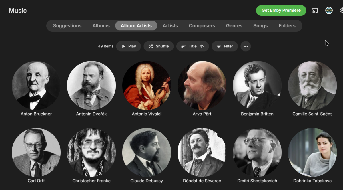
Hi, I was wondering if there was any way of changing the way that artists are listed in for example the view below? What I'd like to do is change the "sort title" for the artists (mostly composers in my case) so for example "Anton Bruckner" ⇒ "Bruckner" and "Antonín Dvořák" ⇒ "Dvořák" , but the problem I then have is that the regular title is what gets displayed, so the page looks like the artists are in a random order, whereas I'd like to be able to display the "sort title" under the image instead. Is this possible? I know I could just change the "title" for the artist to be just their surname, but that won't work with multiple composers with the same surname (eg. all the Bachs) and I'd still want their full name appearing on their pages, just not on the index screens like below. Does any of what I'd said make any sense? Thanks in advance for any help.
-
I recently downloaded Plex to see what it looks like nowadays and I was impressed with how it manages libraries. I root user can have access to all the libraries. However, the home screen can show only the pinned libraries. This is great! I want to havre access to three or four main libraries and hide the rest of the libraries. At the same time I can search for content from all of the libraries and if needed quickly access them. Can this be done with Emby?
-
This could be a feature already, if so guide me. I have keep images in media folder on if this is the cause please tell. In Emby if have a show with multiple seasons this is what the folder structure looks like: Folder season 1 S01E01.mkv S01E01-thumb.jpg season 2 fanart.jpg poster.jpg landscape.jpg season01-poster.jpg season01-fanart.jpg season01-landscape.jpg clearlogo.jpg If watching a certain episode I stop after certain minutes the show gets recorded in continue watching where the actual problem lies. If the episode has thumb.jpg, the thumbnail, which shows in the season view of the the show it should display that but instead it shows every other image in the directory first other than that. If the show has landscape.jpg or knows as show's thumbnail it will show that first. So I deleted that and then it shows the season01-landscape.jpg or the season thumbnail. So I deleted that then it showed me the season01-fanart.jpg or the season backdrop. So I deleted that then it showed the the fanart.jpg or the show backdrop. If i delete that then finally it shows me the thumbnail or the S01E01-thumb.jpg. I could keep it without the seasons thumbnail, backdrop and shows thumbnail it would solve my problem but I don't wanna delete the shows backdrop. That's a deal breaker. Can this feature be added? EDIT: One small note that after the metadata images get pulled it saves the images from tvdb or whatever as episodenumber-thumb.jpg which becomes the primary for the episode. If add that image as thumbnail manually by selecting for one episode it shows that in continue watching. So the problem can be solved this way. After doing so the image doesn't however appear in the media folder as episodenumber-landscape.jpg as it should so it might be taking extra storage.
-
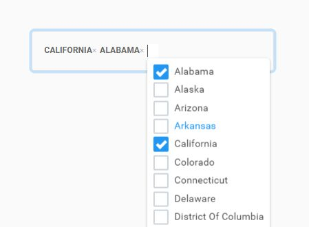
Hi, I want to implement multiselect dropdown, something like this but with Emby colors and style for a plugin configuration page. Can somebody point me to a working example or share code snippet?
- 4 replies
-
- ui
- javascript
-
(and 2 more)
Tagged with:
-
what I don't understand reading feature requests here is just Latin for me but the core of emby is, to my understanding, watching content. and even after more than 6 years this is far away from being good, in terms of ui/ux and general logic. Some things are really beautiful! but only a few things are really designed for watching content why is there still no setting to just use external srt subs? always. period. I've tried all combos and it's a mess. why are my organized srt subs have to be in the end of a line of sometimes 30 internal subs? I want to use them. that's why they are in the folder! it seems impossible to have a setting for sub positioning in the player. no, with every format change of the native content you have to adjust outside if you don't want to have them in the black or to high. why are there only 5 sizes and they are from the screen is full to is there anything. and with some clients the font is so ugly. and if I change the setting outside arrow down on home is of course not bringing me back to my movie. no, it highlights content number 5. why? and if I press sub in the player the standard setting for highlighting is the sub which is running. who designs that? or better doesn't? why? turning it off means pressing up 30 times. and off set on bottom but download on top or vice versa and and and. endless ui ux topics and my usage scenario is so easy and so basic but it just looks like nobody from the devs is using emby? and off set. of course it's not saved so if you have a screensaver because you have an oled you can maintain that again and again and again. and again and turning off theme songs doesn't give you silence in every case. and I really don't know anymore how many times I checked the settings on all clients. 100 times! sometimes only reboot helps, not even leaving emby client stops the song. I'm not a ux pro but I think besides saving a lot of things pressing subs should be 1. on off trigger (highlighted cursor / navigation starts here) 2. offset 3. position 4. settings (size, color, dim, fonts, background ...) 5. download 5. to x, own srts 6. to y, internal and pls. ex srt as standard! save off set! save choosen sub!!! position and settings inside player, more sizes / fine granulation, light Grey not only bright white / ore more dim, I don't see it by the way, pressing pause should hide the sub I think, but don't know if that's possible
- 15 replies
-
timezone for parental controls set to user and not system
nervous_boyd posted a topic in Feature Requests
The web UI for configuring parental control rules is presented in the system time and not the local time of the logged in user. This is confusing and can present problems if the user is not in the same timezone of the server. I would guess it should be a relatively simple adjustment in the Javascript(?) to detect the timezone of the browser and make the proper adjustments in the UI.- 6 replies
-
- parental control
- timezone
-
(and 1 more)
Tagged with:
-
Emby Server browser UI keeps scrolling down when Logitech G29 wheel is connected
Elkhose posted a topic in Web App
Hello, I am having an issue, with the UI in Chrome / Opera / Edge, it keeps scrolling till the end of the UI with no ability to click anything. Troubleshooting the issue, when I disconnected my Logitech G29 steering wheel the UI responded normally again. Disabling the controller from Device manager also fixes the issue. (but we know that's not a solution) I didn't find a way to disable using controllers in Emby (I use a wireless keyboard instead of a controller) -

Completed Emby Theater - Display Title, Duration and other Metadata Below the Selected Extra
funwithmedia posted a topic in Feature Requests
In addition to (but not contingent on) a related feature request ( https://emby.media/community/index.php?/topic/43845-emby-server-emby-theater-support-nfo-files-and-automatic-metadata-lookup-for-extras/ ), I recommend Emby Theater display the full Title, Duration and any other Metadata below the currently selected Extra using something along the lines of the UX pattern called "Thumbnail grid expanding preview". See the following for examples: https://tympanus.net/codrops/2013/03/19/thumbnail-grid-with-expanding-preview/ https://tympanus.net/Tutorials/ThumbnailGridExpandingPreview/ http://www.oriongunning.com/thumbnail-grid-expanding-preview/ http://www.oriongunning.com/demo/gridder/ While the current layout is clean and concise, it is not terribly helpful (in my opinion) in knowing what one is considering watching. As far as I can tell the only ways to get more details are to either start playing the item, or Ctrl-D to view Edit Info (neither of which is ideal when you're just browsing). I think that the "Thumbnail grid expanding preview" UX pattern is a decent route to go and in keeping with the general aesthetic of ET. Additionally, once the underlying code is built for this way of displaying data, there are potentially other uses for this UX pattern. One I can think of at the moment (which can be spun off to it's own feature request at some later point) would be to have items in "More Like This" respond this way, so that you get a mini-detailed view of some of the item metadata and then the option to click through to that item's page to actually play the item if desired. This would enable one to more quickly ascertain (without fully going to the item page) if they want to further explore that "More Like This" item or not. Regardless of additional uses (such as for "More Like This" items), I think that some sort of improvement is definitely needed for displaying the details of Extras, and the "Thumbnail grid expanding preview" UX pattern seems like a decent option to me. PS - If this is something you might like to see implemented, be sure to "Like" this top/first post (as well as any subsequent posts in this thread that highlight particular aspects of what you are interested in) -- "Liking" the top/first post helps the Devs to know how much interest there is in a given Feature Request.- 7 replies
-
- 12
-

-
- Emby Theater
- Metadata
-
(and 3 more)
Tagged with:
-
HI Some questions about the UI for Android TV (ATV) app, and the lack of options that are there in the Android app. 1: Why isn't it possible to add movies to Collections on ATV, this is there in Android? 2: When viewing Collections, why can’t it show “all items” as standard, or have this as choice to be the standard viewing? Collections should not act as Playlists…. 3: SUB sync should be there. +/- in milliseconds would be nice. 4: Sound sync should also be there, as in SUB sync, milliseconds. I really like the Emby app for ATV, but there should be some more choices for the UI. I like to push buttons, but less is more. That’s why I recommend point “2”. And I think that most of the choices we have in the Android app could also work on ATV app? I run Verson 2.0.84g Registered and Server version (4.7.11.0) on Windows 10. Kindly, Petter
- 6 replies
-
- ui
- user interface
-
(and 4 more)
Tagged with:
-
On a smaller window size, the buttons overflow out of its supposed area on the covers (image attached).
-
Hey all, So, I've been curious about this for a while now, not sure if I am either missing something, or if it's not even implemented into the system. Fanart.tv offers image types for clearart, character art, etc, as well as disc art. How does Emby handle these? Where do they appear in Emby UI? Emby supports them, but why if we can't see them? Thanks. - Arly
-
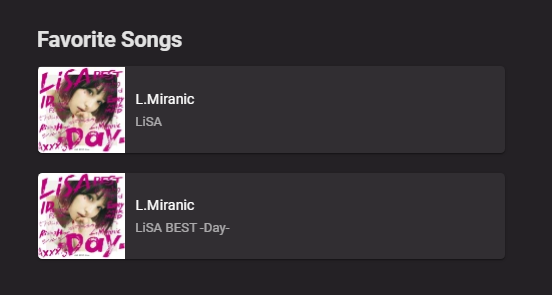
My Recently played list is a bit weird. It shows the track name + album at the top, and the track name + artist at the bottom Favorites songs do the same thing, but the two are inversed (Artist at the top, album at the bottom). Yet Frequently played seems to be fine. I've just ran a library scan, and refreshed the metadata. No changes there. Is it the normal behavior??
-
On the latest Android app for Emby, the UI is not useable when looking at a custom video library with a file with a very long filename (see attached example). It's hard to see, but all the media control buttons are not visible, and it's actually not possible to play that file from the UI. The title is the stuff being blurred out. The app has been like this for a while now, so I apologize if this was already reported.
-

Duplicate Better Visibility for Audio Metadata / IOS UI Tweaks
Guest posted a topic in Feature Requests
I would love to see the option to have Emby show me more advanced Metadata for audio. I tag my files as meticolous as possible and it would be nice to have a display for things like Label, Barcode, ISRC, Catalogue Number, Original Release Date / Media Release Date etc. Basically the values MBP already shows me in it's tagger. But also the more technicals side of things like Sample Rate, Bit Rate, File Format, Mono/Stereo. Video already does that, so why not audio? Also a few more sorting options in Audio would be nice, like having the possibility to sort by Artist AND year, not just one of them. Further I'd love to have the option to turn off backgrounds in certain sections, same with Logos. I like the backgrounds/logos in movies but i dislike them in the music section, sometimes it differs from artist to artist. Another thing is the UI for the IOS Apps, to be more precise the bottom bar. It would be lovely to be able to customise that bar. For example, I don't need fast access to movies on my phone, but on my iPad, the other way around with music. Anyways, thanks a lot for the effort you put into Emby! UI wise I already like it a hundred times more than Plex. EDIT : Not just UI wise. In general. -
Duplicate Next/Previous chapter buttons instead of episode
budokaiman posted a topic in Feature Requests
Hi, I use emby mostly for TV shows, while the skip forward by 10 seconds does alright for skipping intros on some shows, almost all have chapter markers at the end of the intro. It would be much nicer to be able to have skip chapter buttons (forward/back) especially if it meant I could (optionally?) replace the existing "next/last episode" buttons with chapter buttons as skip chapter would still be able to skip to the next episode once end credits come up. It would be nice to be able to change this on web player and mobile player controls. -
Show which library search results are in?
Noodlewasser posted a topic in Non-Emby General Discussion
Hi! I don't know if this can be configured somehow, but I would really like to have the option to display the title of a library for items in the search results. I have different libraries for different languages and formats (4K, 3D, etc.) and if I search for something I can get up to 10 duplicates which I then have to click and hope that I found the one in the right library. If there is no such option, do you thi Just adding the library title to a label below the title and year would solve this problem and improve the search feature by a lot. Do you think this is possible? Edit: I'm sorry I wanted to post this to the "Feature Requests" subforum but somehow messed up.- 3 replies
-
- 1
-

-
- feature request
- search
-
(and 1 more)
Tagged with:
-
I feel like certain parts of the Android app for emby could do with some visual upgrading I know that it is a topic that has been suggested before, but I have attached a couple of concept images of what I believe is a decent update to the current UI to the music playing screen, I suppose similar could be done to the tv and movie casting screen as well. The Images showcase the current interface and my suggested cleaner interface, what does everyone think?
-
all the episodes in Whose Line Is It Anyway are messed up. for some seasons, its all by name of the guest alphebeticaly and not episode order for others its a mix of by guest name and actual episode numbers ( no doubles, i checked) is there any way to correct the way they are sorted or any sorting options at all? release date? air date? dvd order? i cant find a setting for it anywhere screenshot attached
-
Is there anyway to remove the disc border. I just want the album art. Disc border around albums takes away from album art.
-
Would like to see these improvements: Choose genre - search within genre. Current option allows you to browse all of the genres. This is problematic with lots of different genres. Too much scrolling. Bigger Album Artwork when browsing albums. Anyway to remove the "disc" box surrounding album art? Album art is not displayed in background or at all when a specific album is open. Just shows the title and a play button on a black background. Album is shows only when playing a track. It would be nice to see a dislike button to quickly tag songs for later deletion. Smart playlists (filters) are a must for iOS and web.
-
Emby Theater grants non-admins ability to cancel recordings (and My Media formatting problem)
Bob Schnatterly posted a topic in Windows & Xbox
(I searched for the permissions problem but didn't see it. Sorry if I'm repeating other posts here...) I set up the Emby Theater app on Windows for my mother and was careful to not let her do any admin-type stuff, but she is able to cancel my recordings (any recording - movie, show episode or series)! I double-checked the permissions and double-checked them again. As it stands, she doesn't have permission to make her own recordings, or to delete shows or movies, but she can cancel my recordings. I've asked her to be careful not to do that. Also, if you use the large-format icons for the libraries in My Media, the app only shows about 5 of them across and you can't get to the rest of them (no scroll-bar or scroll button). I thought about using the smaller icons, but they're not as descriptive or appealing, so I just rearranged them so the 5 most common ones I think she would use will appear first... The app version is 1.1.248.0, and she's running Windows 10 Home (with all the latest patches) Thanks for your help...- 7 replies
-
- permissions
- My Media
-
(and 1 more)
Tagged with:
-

Emby Server & Emby Theater - Display Seperator/Divider for Plot/Overview of Multi-Episode Files
funwithmedia posted a topic in Feature Requests
Some shows (eg, Phineas and Ferb) can often be comprised of two episodes per "block" (or ~20 minute episode time frame), and in instances where one chooses to keep those as a single file it would be nice if the Multi-Episode support added a little visual divider/marker when outputting the Overview/Plot so that it was more apparent when the plot of one episode ends, and the plot of the subsequent episode (contained in the same file) begins. My proposal is that we just use the same green dot delimiter as is used to separate Genres: <span class="bulletSeparator">•</span> Above from: https://github.com/MediaBrowser/emby-web-defaultskin/blob/gh-pages/item/item.js#L383 It'll be consistent with the overall look/feel, and no knew styles have to be created. I would have done a Pull Request, but I couldn't see anything in the default skin that impacts this -- I suspect that the Plots are combined on the server and then outputted as a single plot. Oh, actually, it just occurred to me that the plot is being stored as a single plot (in the Overview field) because it is a single file (duh!). Looking at the details of an example it does appear that the Plots are separated by a CRLF, but lately Emby Theater has not been displaying those (I thought, though I could be wrong, that in some earlier testing maybe a few weeks ago I had success with those characters being recognized and outputting as space between lines of text). Regardless of how we get there, it would be nice to have a visual separator (whether CRLF, or something else) for these plots. PS - If this is something you might like to see implemented, be sure to "Like" this top/first post (as well as any subsequent posts in this thread that highlight particular aspects of what you are interested in) -- "Liking" the top/first post helps the Devs to know how much interest there is in a given Feature Request.- 14 replies
-
- 3
-

-
- Emby Theater
- Emby Server
-
(and 3 more)
Tagged with:
-

Mouse cursor reappears on media change, does not disappear
SenatorIvy posted a topic in Windows & Xbox
On Emby Theater (latest) in Windows 10 (1803) the mouse cursor reappears when media change happens, and does not disappear after. Ie: Click on episode 1 Move cursor to lower corner of screen out of habit Media bar and cursor eventually fade out Finish episode 1 Mouse cursor reappears in lower corner and never disappears. This gives me the angular resize cursor in the lower corner when I'm binge watching and it drives me bonkers.- 112 replies
-
- 1
-

-
- emby theater
- windows
-
(and 6 more)
Tagged with:
-
I use Emby Theatre for Windows every day on main MediaPC in front room, but the last 5-6 weeks I have noticed stuttering and hanging in Emby Theatre. I finally found by looking at the server Dashboard its transcoding every episode I watch even ones watch previously ok. I have done some testing and found if I use the same Media PC Chrome browser and use the Web UI to watch the exact same episode Emby them Direct Streams the episode without stuttering. I also have a Samsung TV (LT32E390S) in the bedrooms with Emby App and this also plays the same episode no issue, but also transcodes. I can understand or work out why this issue has become so come with Emby Theatre recently. Its only become a frustrating issue the last 5-6 wks appx. Any advice, help, steps to help me track the issue? Setups: Emby Server 3.5.3.0 running on Asustor AS6204T NAS Main Media PC is on Ethernet on Power outputting to 47in Samsung TV Bedroom TV Samsung LT32E390S TV running on 200mps Wifi avg 143mps running Emby App 1.0.53 MediaPC_ffmpeg_Log.txt BedroomTV_ffmpeg_Log.txt
- 5 replies
-
- transcoding
- theatre
-
(and 2 more)
Tagged with:


.thumb.jpg.ec998b67a6e64f06b6745cc0a3b0594a.jpg)


