Media posters
A poster is a principal identification composition whose title, imagery and aspect relationship need to remain useful at the library's display size.
A poster serves as an identification image for a work or release presentation. Its composition can combine a title, recognisable imagery and credits arranged for a portrait-shaped space.
Layout must survive the intended view
Consider an original 600 × 900 poster. That 2:3 ratio is an illustrative choice, not a rule that every poster must obey.
To fill a wide 16:9 rectangle by centered cropping, only 600 × 337.5 source units remain. The retained vertical interval is 281.25–618.75.
A title anchored near y = 90 lies outside that interval. Enlarging the crop does not bring the title back.
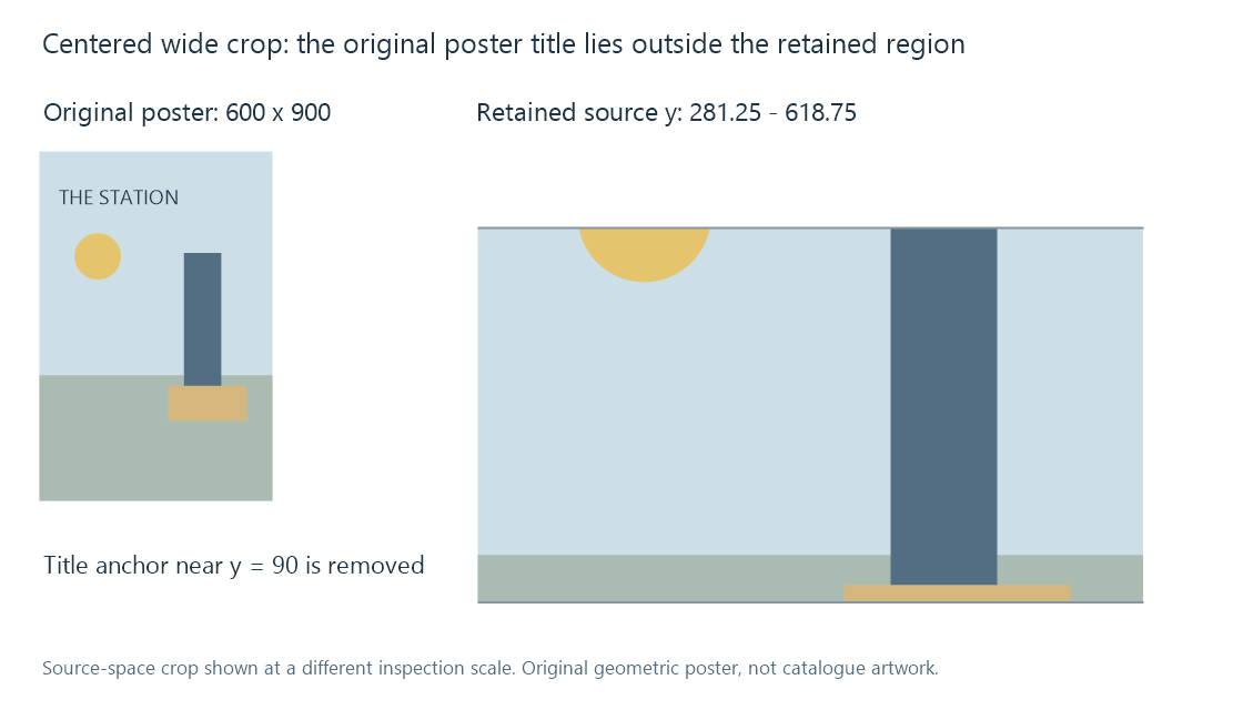
A purpose-made backdrop can therefore serve the wide view better than a poster converted solely by cropping.
A browsing tile changes legibility
A 600 × 900 source reduced to 200 × 300 has one-third of each dimension and one-ninth of its sample count. Small credit lettering and fine texture may cease to be useful at that size.
The source's nominal resolution and its composition answer different questions. More pixels help sampling, while large clear title shapes and suitable contrast help recognition.
Emby's image roles and views supply the product context. The actual app layout determines how the selected poster is fitted and presented.
The image still belongs to an identity
An alternate-language title or edition branding can be deliberate. A poster for a remake with the same name can instead be the wrong entity.
Compare work/edition relationship and artwork language before solving the issue as a resize problem.
A selected smaller asset can be suitable if it matches the intended presentation and has adequate detail. A large unrelated poster remains unrelated at every display size.