











Jump to content

Emby Blog

  • entries
    586
  • comments
    5146
  • views
    3761646

Contributors to this blog

  • Luke 359
  • ebr 71
  • Carlo 31
  • sross44 27
  • 7illusions 15
  • ScottIsAFool 12
  • Abobader 11
  • radeon 8
  • xnappo 8
  • darwindeeds 7
  • Redshirt 6
  • Cheesegeezer 5
  • leedavies 3
  • Aphid 3
  • bigjohn 3
  • snazy2000 3
  • softworkz 3
  • techywarrior 3
  • Soultaker 2
  • chef 2
  • gcw07 2
  • marcelveldt 1
  • hurricanehrndz 1

Fresh New Look


ebr

790 views

Welcome to the New Emby Website

We’re excited to introduce the redesigned Emby website!

The new site features a cleaner, more modern look, simpler navigation, and updated pages that make it easier to learn how Emby works, download Emby Server, find apps for your devices, and explore Emby Premiere.
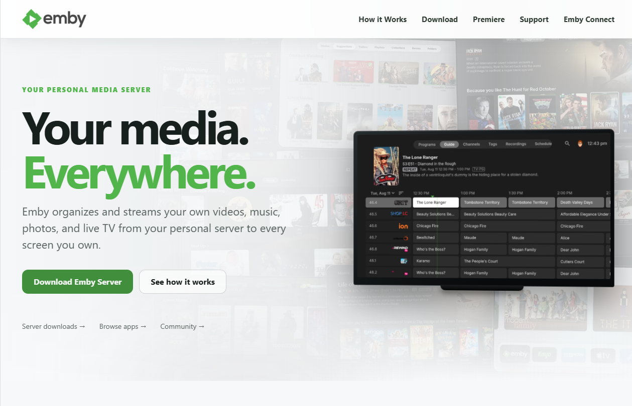
 

image.png

The new design puts Emby’s purpose front and center: your personal media server for enjoying your own videos, music, photos, and live TV on every screen you own.

Take a look around and let us know what you think. Welcome to the new Emby website—Your Media. Everywhere.

  • Like 9

10 Comments


Recommended Comments

Neureka

Posted

The new website is clean, but I still think anyone designing light themed websites as default are psychopaths. 😅

  • Like 1
  • Disagree 2
  • Agree 1
asgard25

Posted

Nice!!!

ebr

Posted

1 hour ago, Neureka said:

The new website is clean, but I still think anyone designing light themed websites as default are psychopaths. 😅

For most people on desktop computers they are easier on the eyes.  Also, when most of the screengrabs being shown off are dark, the light theme works better there too.

  • Agree 2
user24

Posted

Very nice work guys!.

You now have a professional modern look and it's very "on-brand" associating the distinctive Emby logo with the value propositions, through to the details and the action buttons, by using the Emby green color throughout, without overdoing it.

I hope this new design achieves what you wanted it to and helps to draw in many new customers, for ongoing success!

  • Thanks 1
eman1

Posted

I do wish you would make it easier to search. The long stream of alphabet is a real pain and VERY out of date.

mgworek

Posted

Like the new look.

Not sure if this has been reported or not because I am not sure where I would report it so I am doing it here.


The support page is getting cut off at the footer. I tried Safari and Edge on a mac. I can't scroll down any more so the the last line of the Top categories are cut off.


image.thumb.png.e764ee344d8f911a364d07b4358157e1.png

  • Thanks 1
Pejamas

Posted

On 18/08/2026 at 04:38, Neureka said:

The new website is clean, but I still think anyone designing light themed websites as default are psychopaths. 😅

No one "designed this" its pure vibe coding, Eyebrows above every section, the standard font choices, the emdashes and svg arrows.

GrimReaper

Posted

On 8/17/2026 at 10:39 PM, ebr said:

Welcome to the New Emby Website

We’re excited to introduce the redesigned Emby website!

The new site features a cleaner, more modern look, simpler navigation, and updated pages that make it easier to learn how Emby works, download Emby Server, find apps for your devices, and explore Emby Premiere.


image.png

The new design puts Emby’s purpose front and center: your personal media server for enjoying your own videos, music, photos, and live TV on every screen you own.

Take a look around and let us know what you think. Welcome to the new Emby website—Your Media. Everywhere.

 On Universal Android app page, it is not obvious for new users that it can be installed/used on AndroidTV as well: no screenshots, no accompanying text, no indication whatsoever. Maybe that should be addressed somewhat, with the current intention of eventually unifying the apps.

ebr

Posted

18 minutes ago, GrimReaper said:

 On Universal Android app page, it is not obvious for new users that it can be installed/used on AndroidTV as well: no screenshots, no accompanying text, no indication whatsoever. Maybe that should be addressed somewhat, with the current intention of eventually unifying the apps.

Yes, at this point this content was just moved over from the old site.  It needs to be improved.  Thx.

  • Thanks 1
MediaEmby1968

Posted

The design is very nice and modern. Pleasing to the eye.

I just wanted to mention that I think there's a mistake. When you go to download the server and choose Linux (I haven't tested it with the others), the first distro that appears in the dropdown is the last one alphabetically, when in my opinion it should be the first: "Arch Linux".

But that's not all I wanted to point out. If you choose, for example, Arch or Linux Mint, it doesn't matter; all the text always appears below all the distros available for installation, regardless of which one you choose. This could be confusing for a Linux newcomer.

This didn't happen in the previous design.

Create an account or sign in to comment

You need to be a member in order to leave a comment

Create an account

Sign up for a new account in our community. It's easy!

Register a new account

Sign in

Already have an account? Sign in here.

Sign In Now
×
×
  • Create New...